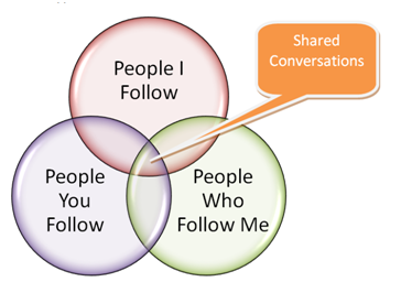
Need some feedback here . . . I was trying to explain to my public relations students how conversations on Twitter sometimes overlap, and sometimes they don’t. It seemed like a venn diagram might help. Is this an accurate portrayal of the overlap of people I follow, people who follow me and people you follow?
Your comments are much appreciated.


Hello there.. very nice and useful writing, I think you really know about this problem. thanks for your posting about this, it help me a lot.
I was just thinking the same thing, and by googling for an application that might visually display overlap (such as with a Venn diagram…) in people who are following people, I found your site. Thanks for creating a graphic for illustrating this idea.
This assumes a commonality between the people I follow and people you follow. This may not be the case at all (only 1 person may be in common), but you can choose or not to see @ replies “People You Follow” use to other people you don’t follow. Is this a shared conversation? Or voyeurism? Ditto (with slight adjustments) of the relationship between “People I follow” and “People who follow me” Plus there may be no intersection between “People You Follow” and “People Who Follow me”, except perhaps if @replies are followed, but again, not sure this is “conversation”. Yes, there is a place where the three could intersect, but I am not sure that the Venn diagram works here. Seems overly simplified to me. Maybe something with arrows indicated connections would be more accurate? With different widths of arrows to represent conversation vs. voyeurism (I know that is a loaded word, but can’t think of a better one at the moment)…
Sorry for the ramble here, but I wanted to give just a quick reaction – wrote it as I thought it.